
DESIGN PROCESS
After conducting our user research and defining our key insights, we designed our system to prioritize personalization of the user experience, so each user can get the most out of this app according to their personal needs, tastes, and preferences.
Team: Justine Chou | Alma Flores Ortega | Annahi Paez | Ell Park | Kenny Ton | Tiffany Vo
Role: UX/UI Designer
Project Duration: 10 Weeks
Programs Used: Mockups, Figma
Personas
From our user interviews, we came up with 2 personas. Carl is our main persona and represents our target user. His pain points, goals, motivations, and important quotes to describe his attitudes towards cooking are included in the persona below. This information was gathered from our user research; for instance, some users reported that they cooked 3-4 times a week. We also took quotes from user interviews and added them to the personas. We wanted to represent these different habits in order to finalize the system features, so that they could better aid multiple users in achieving their goals and easing their frustrations.
.png)
.png)
User Journey
To get a better understanding of the user’s thoughts, feelings, and actions while cooking a meal, we created a user journey map of our main persona. We found that the user went through several different emotions, such as feeling confused when deciding what to cook, annoyance when preparing and cleaning, and happiness and satisfaction when the meal was done and ready to eat. This allowed us to empathize with our user, understanding their wins and frustrations, so we could better tailor our application towards them.
.png)
Scenarios
These scenarios show example situations in which a potential user within our specific target user base could find themselves in need of our system.
Scenario 1:
Sam, 23, a 4th year UCI student majoring in Computer Science, needs to cook more at home because her budget for expenses is limited. She is skilled in downloading and using phone applications on a daily basis because she is technologically savvy. However, with multiple options and different ways to look for recipes to cook for dinner Sam gets overwhelmed and confused with all the information because she wants fast recipes to cook. She believes an application that has recipes that can be filtered will be easier for her while looking for food cook. In addition to this have an option to enter items you have in your fridge would be a plus for her because recipes will be specific to her accessible ingredients. By having all of this in an application it will be a one stop shop for Sam and she won't have to look through google, other applications, or pintrest to get recipes to cook with ingredients she has at home.
Scenario 2:
Emily is a 2nd year at UCI majoring in Education and loves to cook ever since she moved into her apartment at school. She has always helped cook around the house, but finally has more freedom to cook foods she wants to cook and is excited about learning to make new and different dishes. So, she often looks online for recipes on her phone as she is a tech savvy student, but is often annoyed at the fact that most online recipes are usually only for a certain number of people. Calculating the math for every recipe is a hassle and finds other things like ads and long paragraphs annoying. She also finds that she has too many ingredients from recipes and wants to be able to know what to do with her leftover ingredients instead of throwing them out or having to buy even more ingredients to find other foods to make. So, Emily would like an application that could help her with her math and to not waste food.
Storyboards
The storyboards are examples of how our app will be used in the real world. It will help keep us focused on the important aspects of the app.
Finding a Suitable Recipe
This storyboard illustrates the user’s process of using the app from start to finish. It shows the user first contemplating whether they want to cook or order takeout. After looking through the app and successfully finding a recipe that fits their needs, such as meeting their dietary needs and/or utilizing the ingredients that they already have. The app rewards the user with a badge for using the recipe.
.png)
Finding a Recipe with Constraints
.png)
The storyboard above depicts the user’s process of cooking with the ingredients they have by using the app. It is shown that the user has some ingredients and does not have much time to cook. However, They are able to find a recipe that uses their ingredients and the recipe takes about 30 minutes. The user then finishes cooking their dish and uploads a picture of the food they made and earns a Star badge.
Sketches
We decided as a group that each of our team members would sketch their vision of the application. Having each of us sketch our ideas for the application helped bring new creative ways to visualize the application. In addition this encouraged us to use not only one idea, but multiple ones to influence our design decisions when we start to design our wireframes and our low-fidelity prototype.
Home Page
The five sketches of our homepage bring many different and some similar ideas that are represented differently. For instance in homepage sketch 2, 3 and 5 each have a different way of displaying recipes that can be quickly accessed by our user if they find that recipe appealing. In sketch 1 and 4 they both have badges displayed so that users can be encouraged by what they have gained so far. We see that one just shows badges earned and one shows progress and ones that can be claimed. So by combining these two we can have a section that shows earned badges and ones that are in progress to keep the user informed.
.png)
Home page sketch 1
.png)
Home page sketch 2
.png)
Home page sketch 3
.png)
Home page sketch 4
.png)
Home page sketch 5
Search Page
These sketches depict our ideas of the search page of our application. Our team wanted to consider the different kinds of things people want to be able to filter by when cooking. This includes different cuisines, dietary needs, cooking time preferences, and ingredients. After conducting our research through interviewing, we found that having these different categories from which to filter by are important to people.
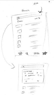.png)
Search page sketch 1
.png)
Search page sketch 2
.png)
Search page sketch 3
Scanner + Ingredients Pages
A feature that we believed would be beneficial to include in our app is a barcode scanner in which users could scan their groceries for a more seamless experience when documenting nutrition facts as well as their groceries. These sketches help visualize how the feature might appear on our app.
.png)
Scanner + Ingredients Page sketch prototype
Wireframes
After reviewing our sketches and discussing ideas we wanted to incorporate from each other, we moved from pen and paper over to Figma to create low-fidelity wireframes of the pages we felt were necessary to include in the app. We decided on which pages to create, and split the wireframes among us to flush out based on the sketches.

Home page wireframe
Home Page
This is usually the first page that the user sees when opening the app. The only exception is when they have downloaded the app for the first time and the pages displaying the options to login or create an account are shown instead.


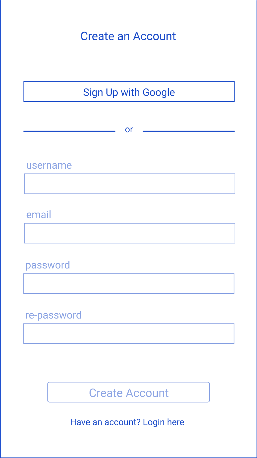
Login / Create an Account
Users have the option of creating an account in order to use some features of the system. Users who create an account can set up their profile, save recipes, set their dietary preferences and restrictions, and collect badges.
Login page wireframe
Create an account page wireframe


Adding Dietary Restrictions and Preferences
Users can add their dietary restrictions and preferences, which will be saved in their profile, to help them find the recipes suited for their individual tastes and needs.
Wireframes for adding dietary restrictions and food preferences

Search page wireframe

Add ingredients wireframe

Scan barcode wireframe

Edit ingredient info wireframe

Search Page and Adding Ingredients
Users can search for recipes through the search page (left) and use the filters to add the ingredients they already have (right). Using this filter returns recipes that only use the ingredients added.
Barcode Scan Page
Users can scan the barcodes of ingredients they have so that they can easily add ingredients. After scanning a barcode, the interface navigates to a page prompting the user to fill in additional information about the item.
Saved Recipes Page
Users can view their saved and favorited recipes here, and can also search through these saved recipes, applying the same filters as the search page. There is also the option to toggle between showing all saved recipes and only showing their favorited recipes.
Saved recipes page wireframe
Recipe details page wireframe
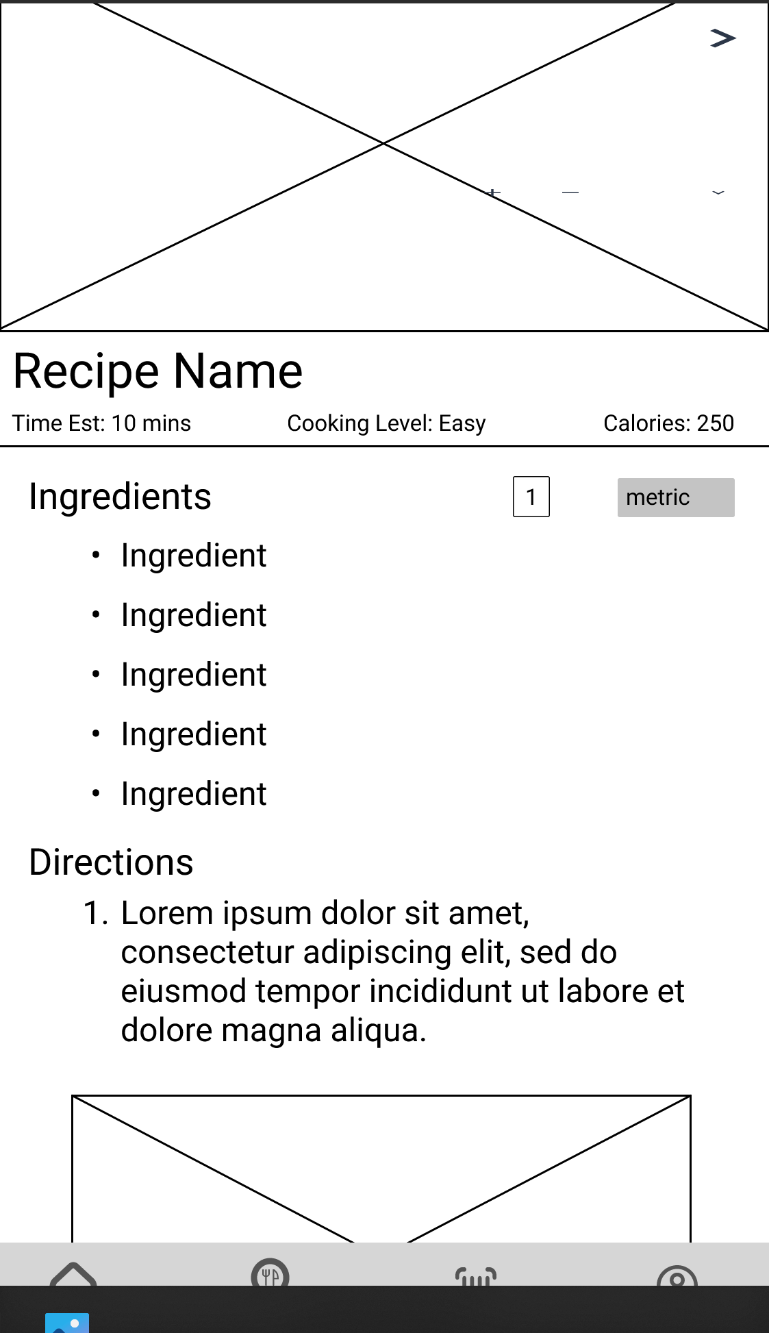
Recipe Details Page
The recipe details page shows the recipe, including a recipe image, cooking time, ingredients, directions, and nutritional information. Users can also adjust and convert the amounts of the ingredients as needed.
Overview
Problem: Many UCI students find it difficult to cook, whether they lack the time, experience, and/or motivation.
Solution: An application that helps students find simple recipes using the ingredients in their homes to help streamline and simplify the process of cooking. The app will recommend users recipes based on what they’ve cooked before and what ingredients they have so that they don’t need to spend time figuring out what to cook and how to cook it.
Key Insights: After conducting user research and defining our key insights, we designed our system to prioritize personalization of the user experience, so each user can get the most out of this app according to their personal needs, tastes, and preferences. Our main features include allowing users to filter through recipes based on their diets, save recipes, specify their dietary preferences and restrictions, keep a digital inventory of their groceries, and participate in optional monthly challenges to encourage expanding their cooking skills.
User Evaluation
Objectives
The objectives of our user evaluations were to find the answers to the following:
What are users’ first impressions of the app?
Do the options in the navigation bar make sense to users?
Are users able to search for recipes with items from their fridge successfully?
What are users’ thoughts on the monthly challenge being the first thing they see?
User Profile
We will recruit users who use the internet or other platforms to search for recipes since it is similar to our prototype. They will be UCI students between the ages of 19 and 25 who search for recipes to cook at home.
Method
We will each recruit 1 user for a total of 6 users, one person per team member, for individual testing sessions. Each session will be either held over Zoom or conducted in person and led by one of our team members. They will share a link to the prototype and ask the test user to share their screen via Zoom or use the proctor's computer within eye range while on Zoom. They will record the Zoom session. They will observe and take notes during the session.
How we conducted the tests
Each of the team members asked a participant from our target demographic to be part of our usability testing. We shared a link to our interactive mid-fidelity prototype, and verbally stated a series of tasks for them to complete. As they went through the mockups, they shared their screen with us and thought out loud as to their initial thoughts and reasoning behind their decisions in order to successfully complete the task. After each task and at the end of the session, we asked follow up questions regarding their experiences and the difficulty of the task.
Tasks
Task 1: Setting dietary restrictions and preferences
Description: The user should create an account and then fill out the preference/dietary pages. In the process they should also save the suggested recipe.
Summary of Task 1
Thoughts and experience:
The users overall expressed that they wanted more category food suggestions
Some users who were unfamiliar with Figma prototypes were confused by the lack of aesthetics and high-fidelity features.
Missed Clicks:
Suggested recipe
Clicked on the recipe name which is not prototyped. They had to click on the recipe image.
Were they successful:
Every user was successful and completed the task.
Task 2: Home screen and searching for a recipe
Description: The user should take a look at the home screen and talk about what they see. They should say where they think each of the icons on the bottom navigation bar would take them. After they have familiarized themselves with the home page, they should find a recipe that they can cook for dinner that includes chicken as an ingredient.
Summary of Task 2
Thoughts and experience:
Category on search page was useful to find recipes faster
Confusion on some stuff can be eliminated with onboarding screens
Missed Clicks:
Clicked on categories rather than search bar the first time
Were they successful:
Every user was successful and completed the task.
Had no issues identifying any of the icons in the navigation bar besides the fridge icon, which they quickly understood after clicking on it.
Task 3: Add an item to ingredient list and find a corresponding recipe
Description: The user should use the barcode scanner to scan a barcode on a sample chicken package and use their Fridge page to find recipes that include chicken and avocado.
Summary of Task 3
Thoughts and experience:
Liked that you can find recipes after scanning items from your fridge
May be difficult for some because of the check boxes in the list
Missed Clicks:
N/A
Were they successful:
Yes they were successful in doing the task
Task 4: Locate a saved recipe
Description: The user should try to find the recipe that they had saved earlier.
Summary of Task 4
Thoughts and experience:
Have saved section on home page just like favorite
Pretty easy and simple for all users
They remembered where the saved tab was when they did task 2
Missed Clicks:
N/A
Were they successful:
Every user was able to complete the task with relative ease.
Task 5: Difference between saved and favorite icon
Description: The user should click on a recipe of their choice and take note of the two different icons on that page that they can click. The user should talk about the difference between a saved recipe and a favorite recipe, and how they would distinguish between the two.
Summary of Task 5
Thoughts and experience:
Most people understood the difference between liking and saving, but there was one confusion about the difference
Missed Clicks:
N/A
Were they successful:
They were successful.
Summary of Findings
Overall our users were able to understand and complete the task successfully that we presented to them. However, we learned that some of our features in the application could have been thought out a bit better. For instance, one thing that stood out to our team was that one user noticed favorites on the home page, but there was not a saved category on the home page. This made us realize that we should also have a saved category on the homepage to allow users to navigate to those respected categories without needing to click on the search icon on the navigation bar. In addition it is always useful in design to allow users to be able to have more than one access point to a certain page if possible.
Final Prototype
Challenge
The prototype was challenging to design because we had a lot of features and functionalities we wanted to add to the application. As a team we designed each page and their corresponding pages for clicked states on Figma. However, feedback from our professor suggested that we should create interactive components in our design to reduce unnecessary pages and to gain additional realism in our application. Learning how to create interactive components was a bit difficult in the beginning, but after watching some YouTube videos, one of our teammates, Annahi, was able to create all the components in our design. This made our prototype more functional to our users because we did not limit them from clicking different options in our food/dietary preference pages. In addition, it made the design more interactive for users because they were able to see the different components change when hovering, clicking, or in their unclicked state.
Future Work
For future work our team would like to accomplish the following in order to improve our application:
One thing we would like to add to our application is a cookbook feature for users. This feature would allow users to upload custom recipes that the user wants to share or simply keep for their own reference. These custom recipes would be in their cookbook as well as other saved and favorited recipes. This would allow users to find all these recipes with more ease and have more organization.
Another step we would like to take is to make a more high fidelity prototype. We would want to ensure that it feels like a completed application. This would include adding images, recipes, choosing an aesthetic color scheme, and allowing the features to operate as it should.
Finally, a third step would be to keep improving our application. Our team would like to take into consideration user feedback. The feedback would be collected through user evaluations of our prototype. We would alter if and when necessary according to the feedback because we want our users to have an application that can give users the best experience.